About
HUNGER Church ATL, a dynamic and growing congregation, sought a brand identity that would capture their unique spirit and inspire their community. Diff'rent was tasked with creating a logo, color palette, and branding guide that would reflect the church's core values and connect with their audience.
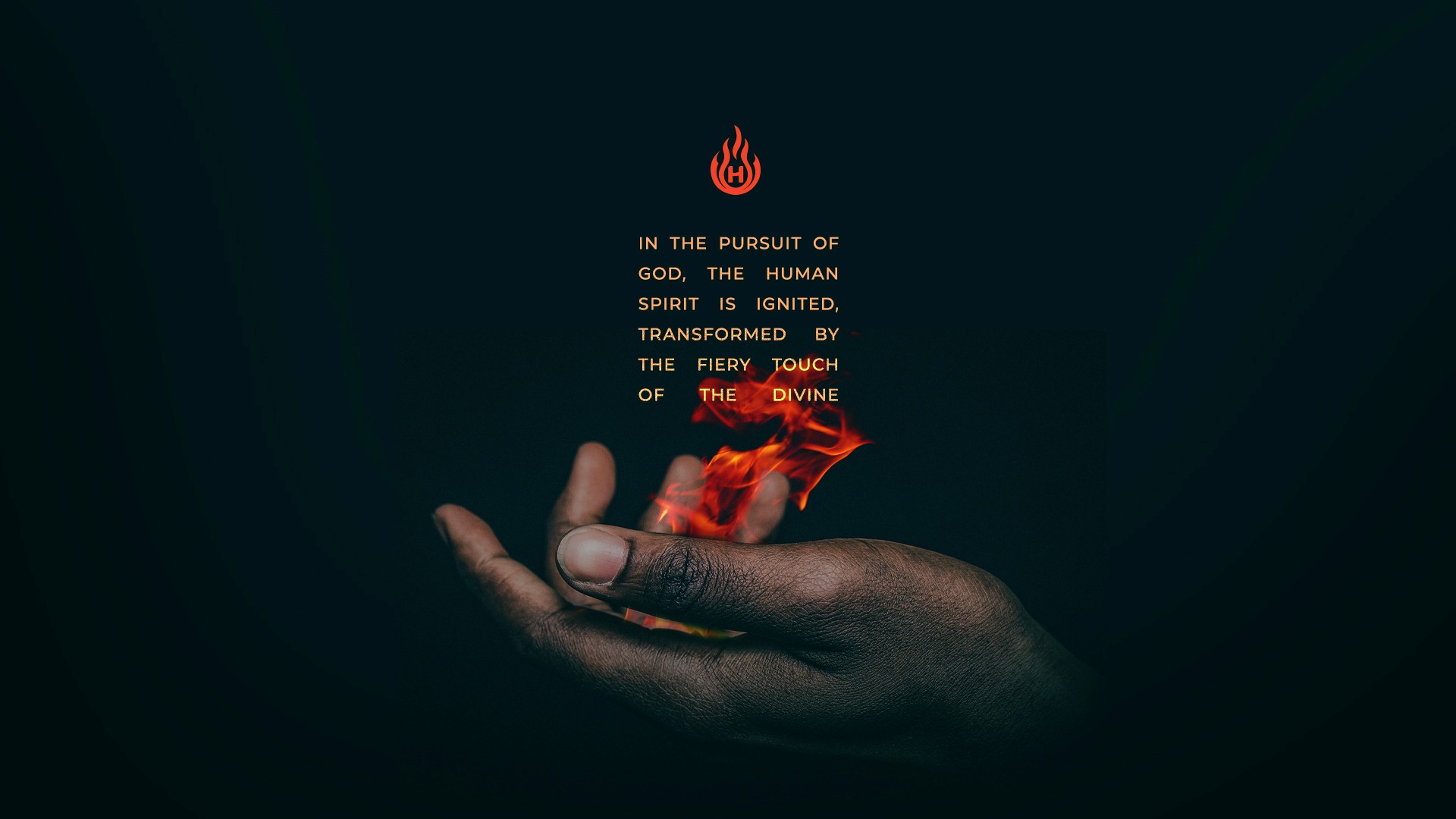
Branding Concept: The emblem of HUNGER Church ATL is a powerful symbol that represents the intersection of the divine and the human. The ethereal flame of the Holy Spirit and the outstretched hand signify the congregation's unwavering pursuit of a higher connection. The vibrant flame symbolizes the guidance and enlightenment of the Holy Spirit, while the reaching hand represents the human spirit's desire to be ignited and transformed by the divine.
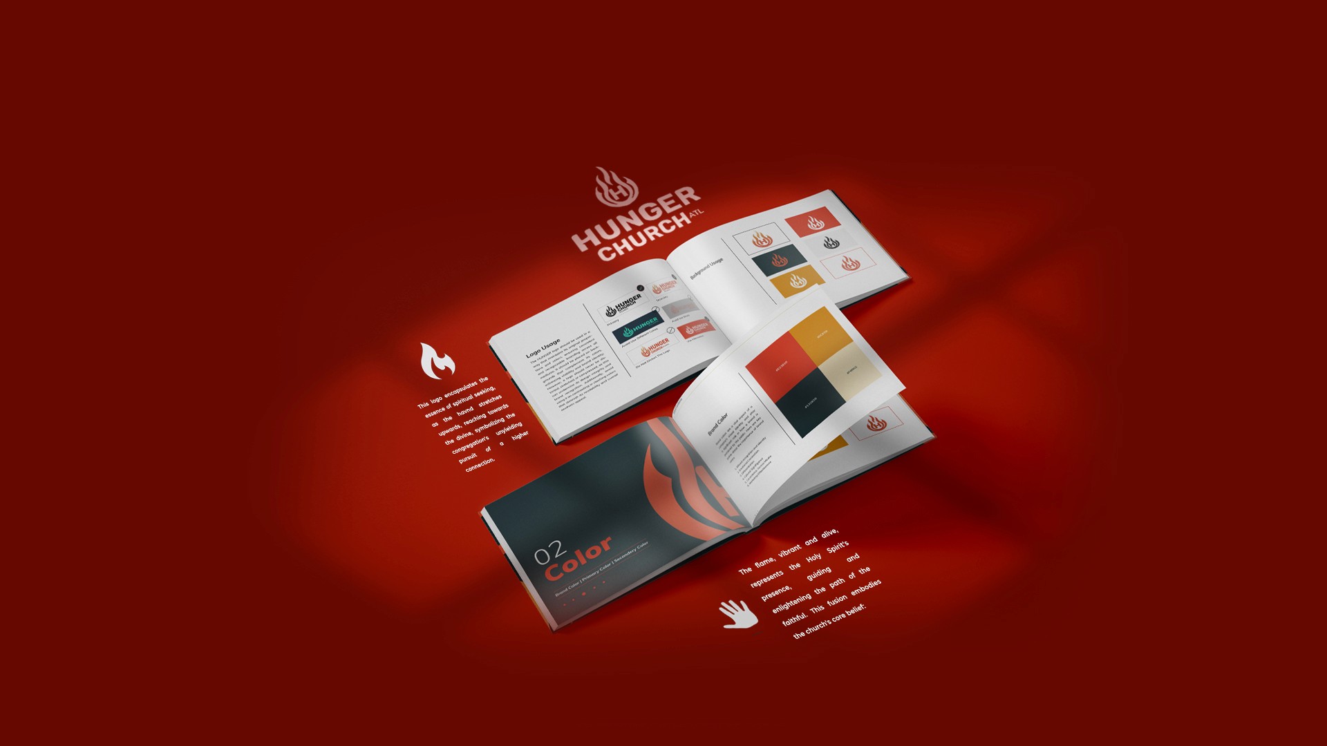
Logo Design: The logo incorporates the flame and hand symbol in a visually striking and memorable composition. The color palette chosen for the logo complements the symbol and evokes feelings of inspiration and faith.
Branding Guide: The branding guide provides guidelines for the use of the logo, color palette, and typography, ensuring consistency and maintaining the brand's identity across all communication materials.
Results: The branding created for HUNGER Church ATL effectively captured the church's unique spirit and connected with their community. The logo and branding guide provided a strong foundation for the church's visual identity, helping to establish their brand and attract new members.
Client
HUNGER Church
Category
Brand Identity
,
Apparel Design
Year
2024


More projects


